Redesigning Bodhi Tree
About Bodhi Tree
BodhiTree is an online learning platform for students all across India that hosts interactive multimedia books including lab manuals that mimic classroom teaching. It includes curated video courses, content, quizzes, lab experience, and course material by the esteemed professors of IITs in different domains. BodhiTree provides an integrated learning management system (LMS), the entire ecosystem needed to use these books to run engaging classes and labs.
BodhiTree is a platform Much like regular books, BodhiTree books (BodhiBooks) are made up of chapters, which are made up of sections, which in turn are made up of elements like interactive videos; auto-graded practice problems; reference material; slides; auto/manual graded lab exercises, etc. BodhiBooks are accessible via a web browser as well as a smartphone app.
Role
Since Bodhi Tree was an already established website being used by the IIT students all across India, the development team- CSE department of IITB wanted to redesign the website to make Bodhi Tree more usable. The user experience of the earlier version of Bodhi Tree website was acting as a constraint to the students and professors. As a part of our course - “Usability Evaluation and Studies” we were asked to do usability testing of Bodhi Tree- Educator in teams.
But since I wanted to see this project through even beyond the curriculum, I decided to take it up later and use and implement the learnings. It was my first project as a sole designer where I had to work with the engineering team and implement the design. It gave me an opportunity to work with the engineering team closely and understand the project workflow. The team included -
Head Faculty, Kameswari Chebrolu : To understand the whole scope of the project and its requirements. There were a lot of new things we were introducing like the dashboard and revamping a few of the existing flows such as the schedule and database.
Senior Developers and stakeholders: To get timely feedback on my designs and the design direction.
Engineers: To ensure that the final output matched the design exactly.
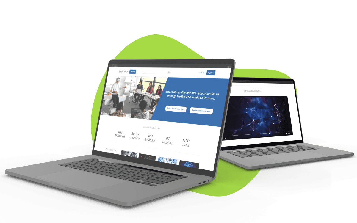
Bodhi Tree Internal Educators Platform
At Bodhi Tree, we were experiencing some serious growth with a surge of educators and students using our platform. However, the educators were struggling to manage their schedules and courses with an outdated internal portal that lacked the necessary functionality.
To solve this problem, we decided to give the portal a complete overhaul. With a user-centric approach, I redesigned the Bodhi Tree Educator platform as an intuitive and efficient tool that allowed them to better manage their coursework and schedules.
Research
The developers and creators of Bodhi Tree- Professors and PhD students of CSE Department of IIT Bombay had created Bodhi Tree with a vision- to connect professors and learners through digital channel. Bodhi Tree is to be used by professors to upload their course materials and tests, and also by the students to access the knowledge. However, through user studies, it was found that the engagement of students, as well as the professors at IITB was very less than anticipated.
I worked on doing domain research, secondary research, and market research to understand the available learning tools that the users are used to to understand the context of e-learning well. I also did primary research with various IITB professors and students to understand their pain points and needs.
Usability tests were conducted to identify the issues with the Bodhi Tree platform, and to gain insights from the diverse range of users that the platform attracts. The tests were conducted as a coursework and helped extract different insights from the various users that Bodhi Tree sees.
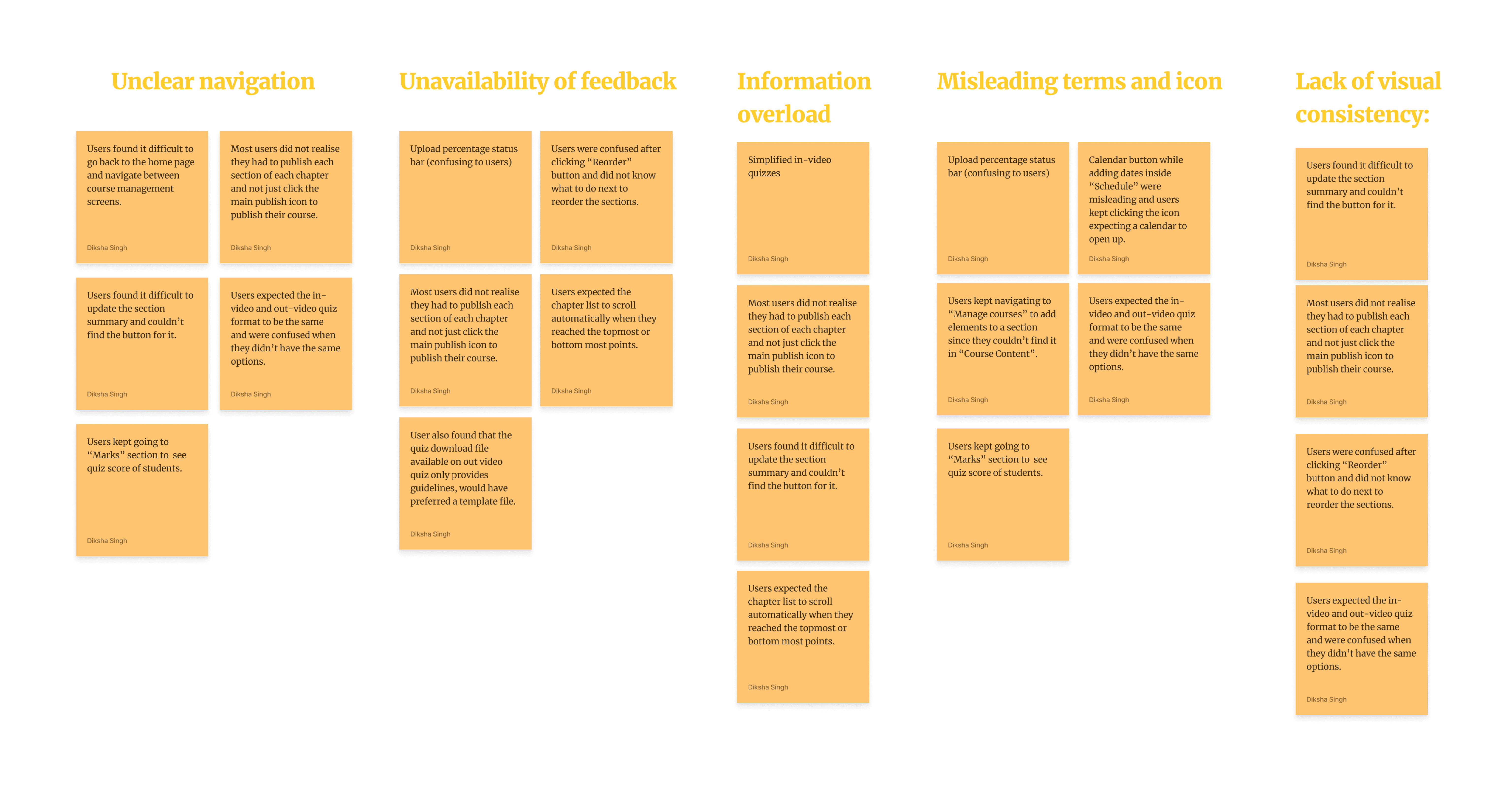
The main issues identified through the tests were then abstracted and used in Affinity Mapping
Problem Identification
Using Affinity Mapping, the Issues were simplified as:
Unclear navigation: Users found it difficult to find the information they needed, resulting in frustration and decreased engagement.
Unavailability of feedback: Users were not provided with sufficient feedback on their actions, making it difficult for them to gauge whether they were making progress.
Information overload: The platform presented users with too much information, making it difficult for them to identify the most important details.
Misleading terms and icons: Users found it difficult to understand the meaning of certain terms and icons on the platform, resulting in confusion and incorrect usage.
Lack of visual consistency: The platform lacked a consistent visual language, making it difficult for users to navigate and comprehend information.
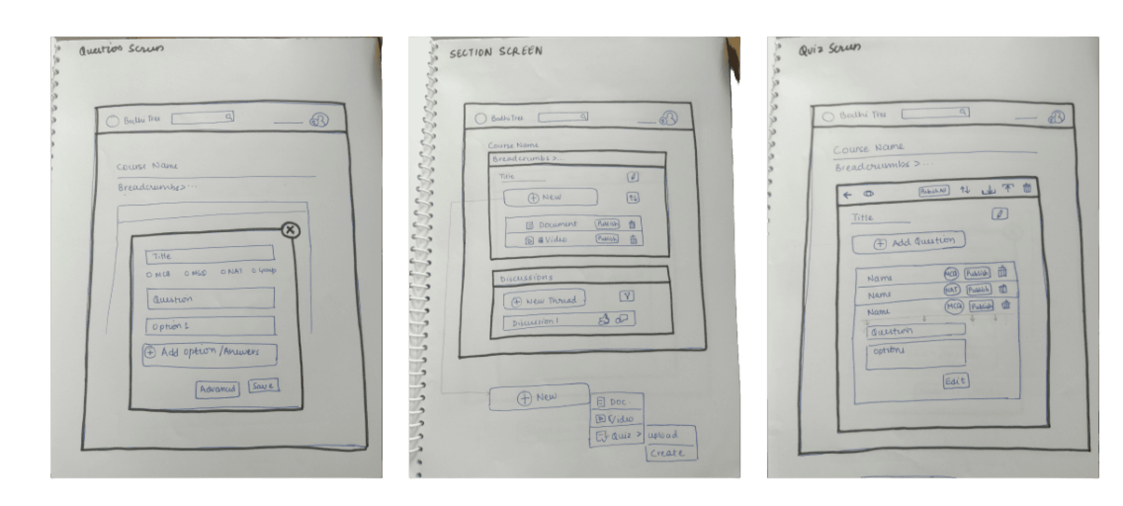
Paper Prototypes
To redesign the website, low fidelity paper prototypes were initially created to establish the information architecture. I spent considerable time and effort on this stage of the process, carefully considering the layout, structure, and organization of the platform to ensure a smooth user experience. The wireframes were then tested with users in order to gather feedback and refine the design. This user testing phase was critical in identifying areas of improvement, as users were able to provide valuable insights on the usability and effectiveness of the wireframes. Overall, the paper prototypes were a valuable tool in guiding the redesign process, as they allowed the team to visualize and iterate on the design before committing to a final product.
Final Solution
Addressing these issues was crucial to improving user engagement on the Bodhi Tree platform. By implementing a more user-friendly design, we were able to create a platform that was intuitive, easy to navigate, and visually consistent. This resulted in a significant increase in user engagement and satisfaction.
Clear visual hierarchy
Straightforward Navigation
Clutter-less
Gives Intuitive Feedback
Screens and Prototype
Some of the major screens designed as a part of this project are:
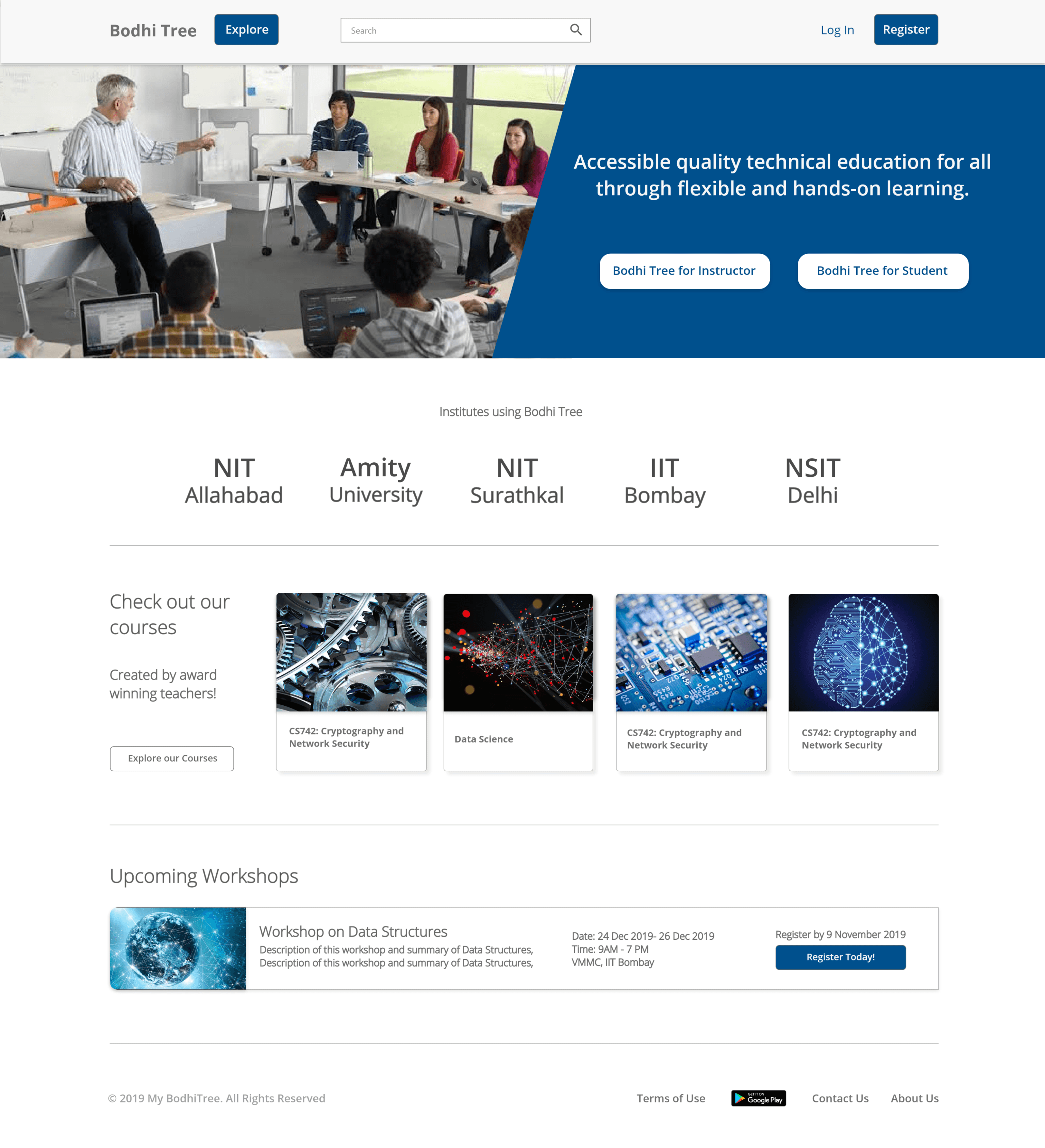
Homepage
Both, the instructor and students can use the landing page to navigate their journeys, without much hassle
The Hompage was made clearer and visually cleaner, less clutered, and enticing
Social proof, relevant courses, and information was layed out in this page
Better layout, and Straightforward Offerings
Immediate updated information - like workshops, was also added in the front
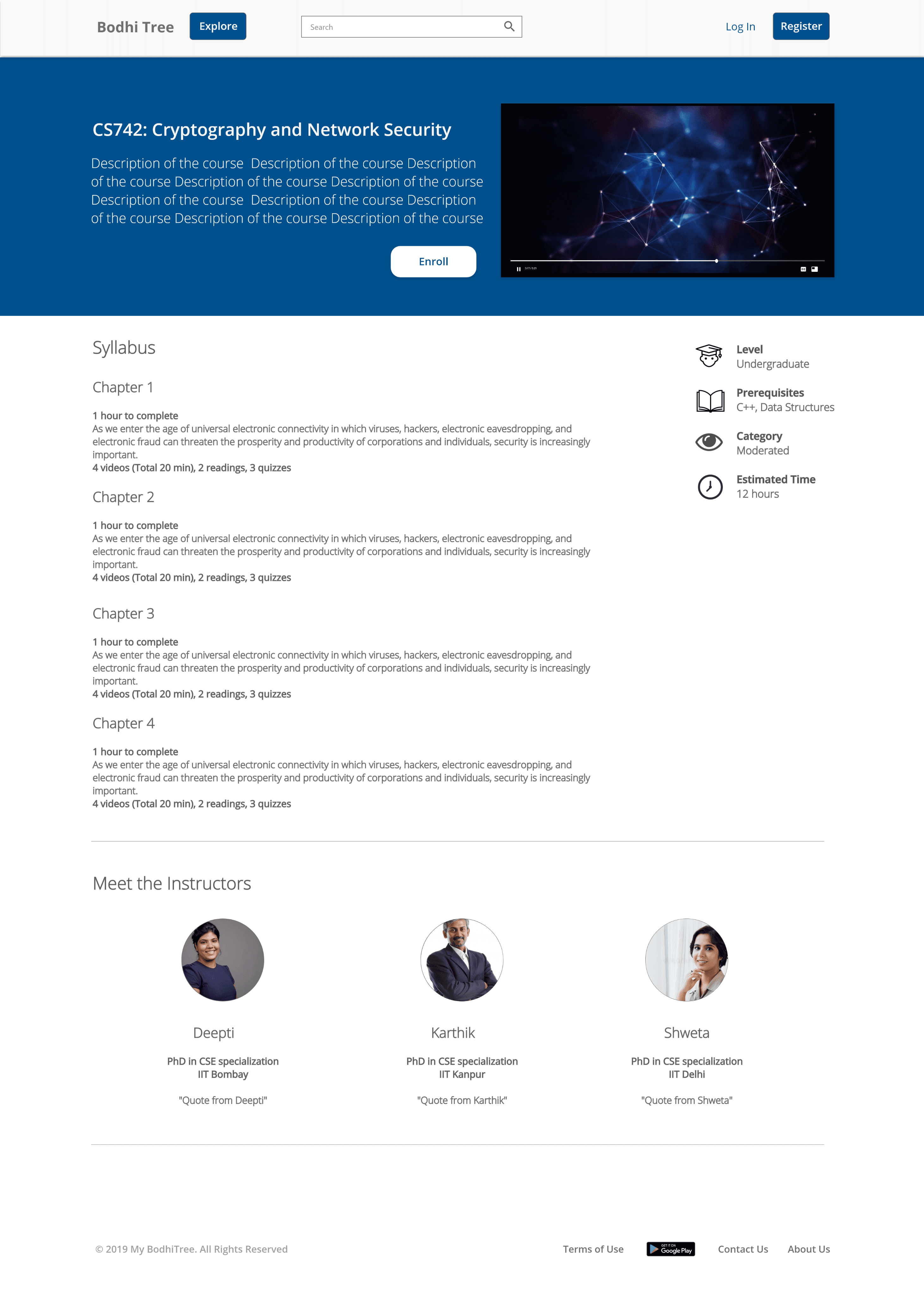
Offerings and Course Page
Information (like time taken, quizzes, syllabus, etc) was clearly layed out with actionable CTAs
Cleaner offerings
Video Tutorials at every step
Relavent information for students - what level is the course, how hard is it, prerequisites, and time taken was also added for convenience

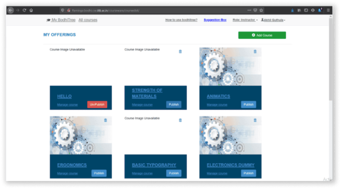
Instructor- Course Page
A simple dashboard was created for all the courses created for instructors
Relevant actions like Publishing, reordering, downloading and deleting were brought outside for the instructor to view their courses at one glance
Add Course button was added to make it easier for the instructors to add new course for their students

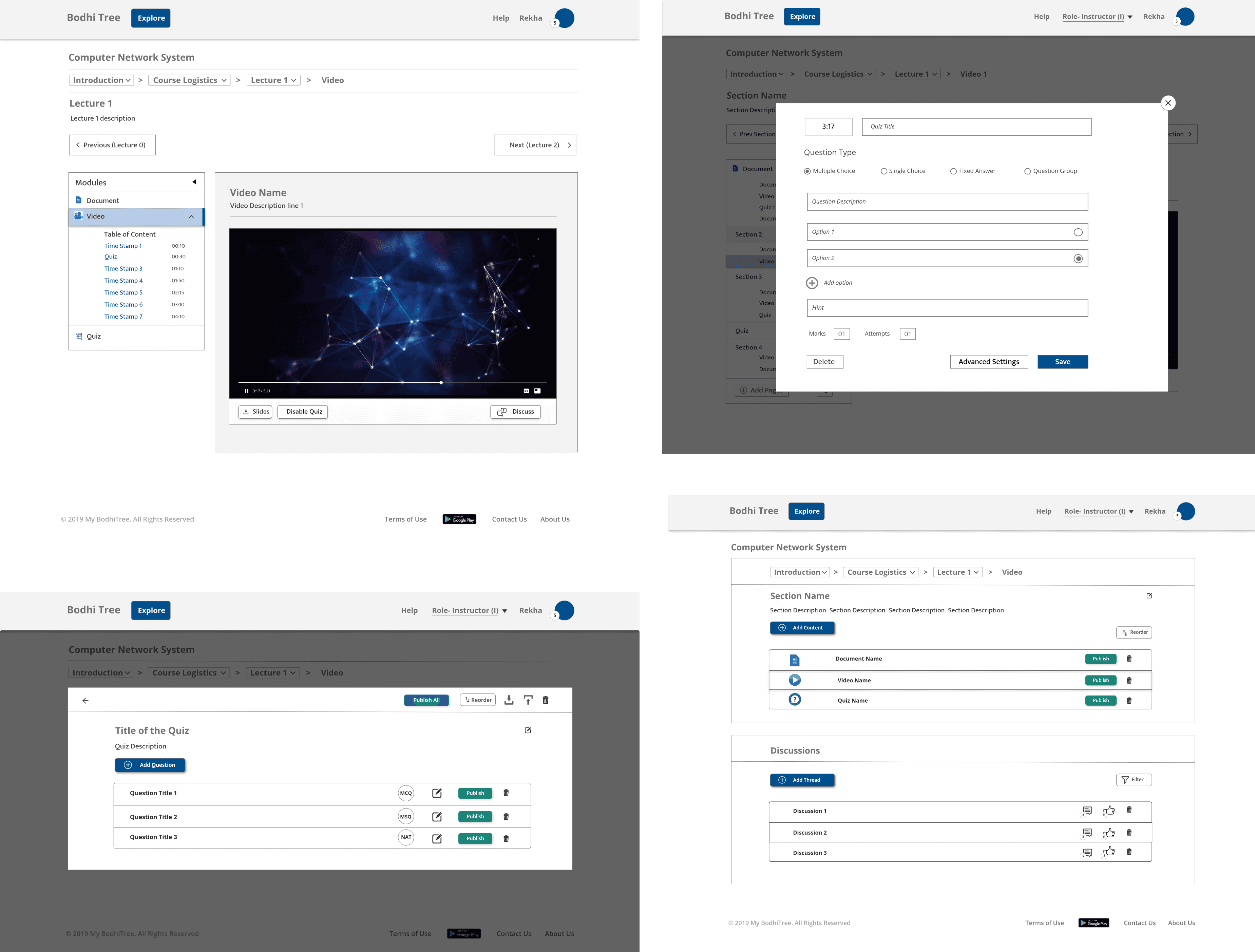
Course Content
Final Screens

(Almost) All Screens
Learnings, Insights, and Retrospection
So these were my learnings after working on this project.
This was a big project. Lots of pages, user flows, and edge cases. It was my first time working on an LMS so it was a very interesting thing for me to design.
Since it was the first time I was working on a project as a sole designer, with the engineering team, it took me time to figure out my role, and responsibilities.
It was also a learning experience for me to see how engineering team thinks and works, there were meetings everyday, where we just sat and peeled back the website's layer and design, step-by-step.
What was also a learning to me was to understand technical limitations, cost, and time-constrains and how to work under them
Since there was a lot of content on every screen ensuring good information architecture was little than I expected. But in the end with a lot of iterations and feedback, I was able to pull it off.
I now realise, looking back at the project, that the visual design was something that could've been improved, to enhance the user experience and making the website less-intimidating for the students, and professors.
I really enjoyed my time at CSE department of IITB and its building. The engineering team and my mentor- Kameswari Chebrolu were exeptionally patient with me and the learning process. I was realaly glad I took the extra step to realize the coursework and see its real implications